For several years I have searched for cycle-independent metrics to analyze the performance of companies in the semiconductor equipment industry. The problem I was trying to address was how to judge the performance of businesses in the presence of violently cyclical economics. Usually what happens is that in an upturn everyone looks great and gets big bonuses and in a downturn the opposite happens, even though it is in the downturn that some of the most brilliant and important management is done. To make progress on this problem I eventually fell back on some simple first-order business models. The approach has a lot of power, but of course also has important limitation, which I will discuss at the end.
It is back to basics. In simpler days, people used to talk about businesses in terms of fixed and variable costs where it was very clear what was fixed (buildings, tooling, etc.) and what was variable (labor, raw materials). People still talk about businesses this way, but what is fixed and variable has changed enormously, with outsourcing, futures contracts, etc. Still, it is possible to still approximate the profit from operations (PFO) of a business as a constant (the fixed part) plus a term linearly dependent on revenue (a variable part). At revenue = 0, the PFO is a negative number representing the fixed cost of the business. At PFO = 0 one has the revenue required to achieve breakeven. And the slope (d PFO/d Revenue), since we are talking about pre-tax values, is the gross margin. WARNING: This is not the gross margin your finance department talks about, but it is the reality of how PFO increases with increasing Revenue. An example of this is shown below for different (Revenue, PFO) pairs starting from 1996 and going to 2005.
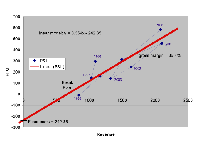
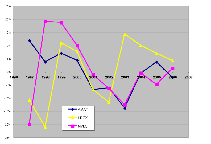
This works great for divisions, which generally represent a single business, and ok for companies. Unfortunately, I cannot show you examples for divisions since all of my data there is proprietary, but I suggest you try it yourself. I predict the correlation will work great. Do it in Excel and Excel will even do the linear fit for you and show you the gross margin and negative of the fixed costs, as shown above. Once you have the linear model, then one can substract off the model from the results and see how the business is evolving over time. If one is beating the model, which is a historical average of sorts, then the numbers are positive. If the business is doing less well than the historical results, then the numbers are negative.
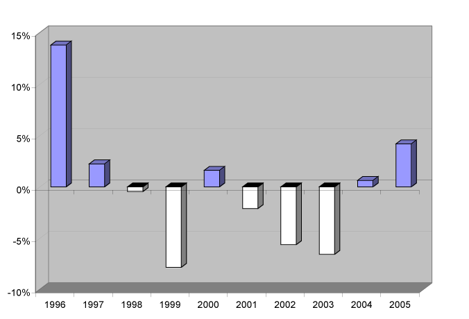
When this is done for companies, there are all sorts of complications, e.g., changes in accounting, acquisitions, “one-time” write-offs, etc., but as we shall see, it is still illuminating.
Let’s plot this for three semiconductor equipment companies: Applied Materials (AMAT), Lam Research (LRCX), and Novellus (NVLS) . For PFO I will use pre-tax earning simply because that is easier. The six graphs are shown below.
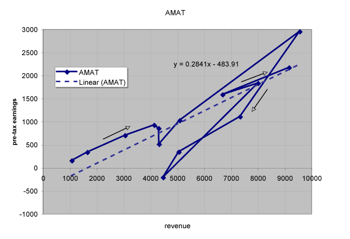
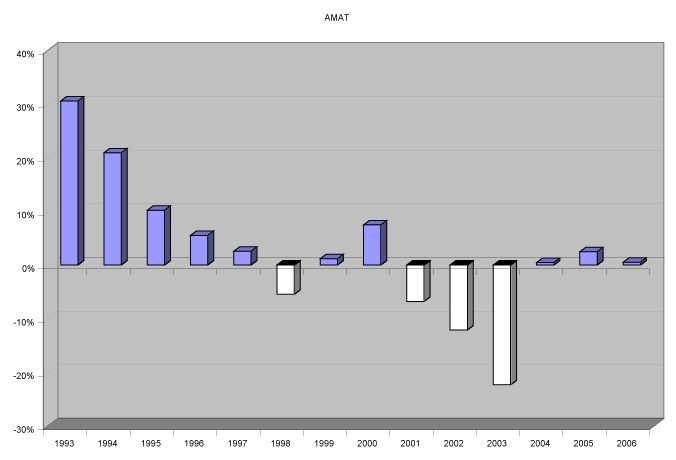
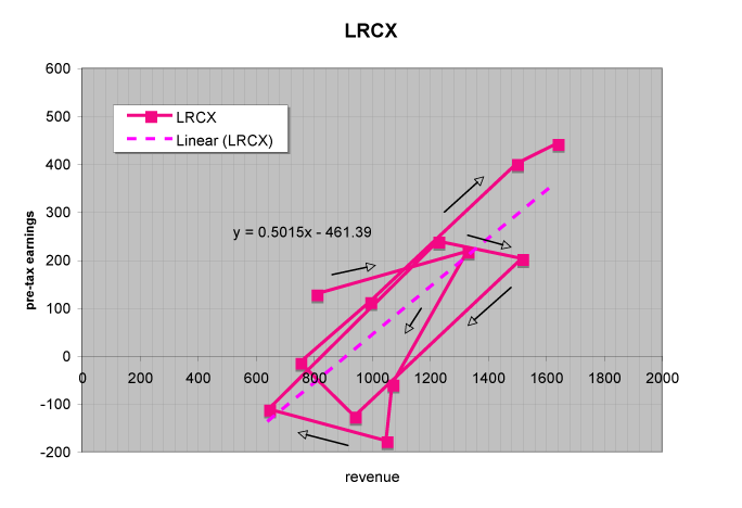
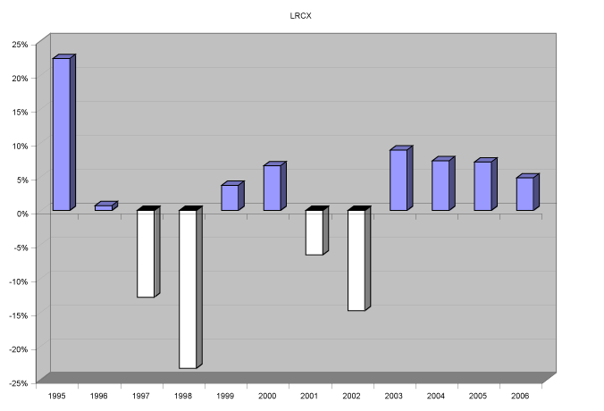
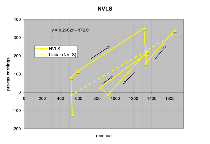
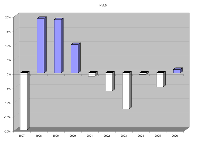
There are some interesting patterns that emerge. The first is the moon-shot of doom. As business improves, the company accelerates that improvement by increasing efficiency. Unfortunately, a lot of that efficiency is obtained by turning variable into fixed costs. This is completely natural. For instance, find a repetitive task done by labor and buy a piece of capital to do the same job for less. Sounds smart. The problem is that when the market collapses, which it does with maddening regularity, the fixed costs remain while the revenue does not. (In this example one could have avoided this by getting someone else, with customers in many uncorrelated industries, to buy the equipment and charge you for what you use.) You can see this pattern repeated by several of these companies and it is likely you will see it again at the next downturn.
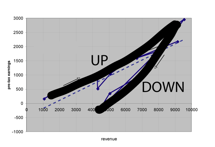
A second interesting pattern is the clockwise loop. This occurs when executive management is slow to implement corrections. The business goes up and expenses eventually go up with it, but as the business goes down, it takes some time for the expenses to fall. Eventually the expenses fall, but then the business turns around again and again the company reacts slowly. (One might argue that it is good to be slow to add expenses, but if the expenses are not needed, why add them at all?) Of course some of this is built in. For instance, reductions in force take a couple of quarters to work their way to the bottom line because of notification times, severance, etc., but the key is to squeeze the loop as much as possible. LRCX has done two loops over the time period of this graph–there management is committed to not doing a third!
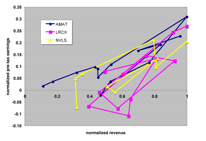
Below one can see these three companies on the same scale. I have fit the model to the years 1997 to 2006. These are the company’s fiscal years, so they are actually time shifted slightly from each other, but that is a negligible effect.
And this is how the stock market has reacted.
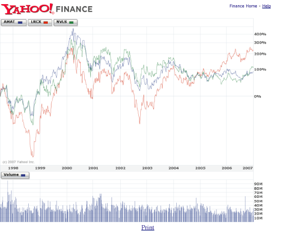
As you can see, the bubble was traumatic for everyone. AMAT has regained their keel, but not their former glory. LRCX has become the darling of Wall Street in recent years by consistently beating their model and NVLS has been rewarded recently for improving execution that finally got them back to an even keel and for a new higher level of revenue. Note, however, their fixed costs compared to before the bubble and compared to LRCX. The next downturn will be very telling for all. Who will react slowly (or who built a business structure that cannot react quickly)? Who will have added a bunch of fixed costs that come back to haunt them? Who will have fundamentally improved their business model by operating on a higher line?
As promised, I do need to talk about the limitations of the approach. There are two major shortcomings. First, it could be the case that a business is doing well by just keeping their position in an increasingly competitive environment where Porter’s five forces are all moving against them. Second, this model does not explicitly take into account underlying growth rates. Take a look at the early AMAT years—they were growing like a weed and creating tons of shareholder value. Here I refer to our discussion on growth vs operational excellence and the stock price.
Nevertheless, I believe that the graphs and interpretations shown here are one useful tool in analyzing reasonably mature businesses in cyclical industries, especially if used at the P&L level.

